When Visual Signals Don’t Align With Meaning
Thanks to the Canadian wildfires, my home, Pittsburgh, PA, resembles the home of Star Wars hero Luke Skywalker, Tatooine (except we only have one sun).
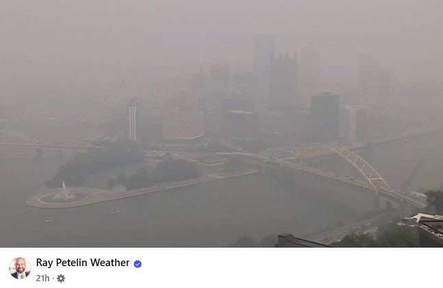
Yesterday, the Air Quality Index Level went from Orange to Red. Today it went up to Purple and then Maroon. And I knew it was getting worse, but when it went past Red into Purple and Maroon, I was not sure if that meant it was getting worse or better. I had to ask Google and here is what I found.
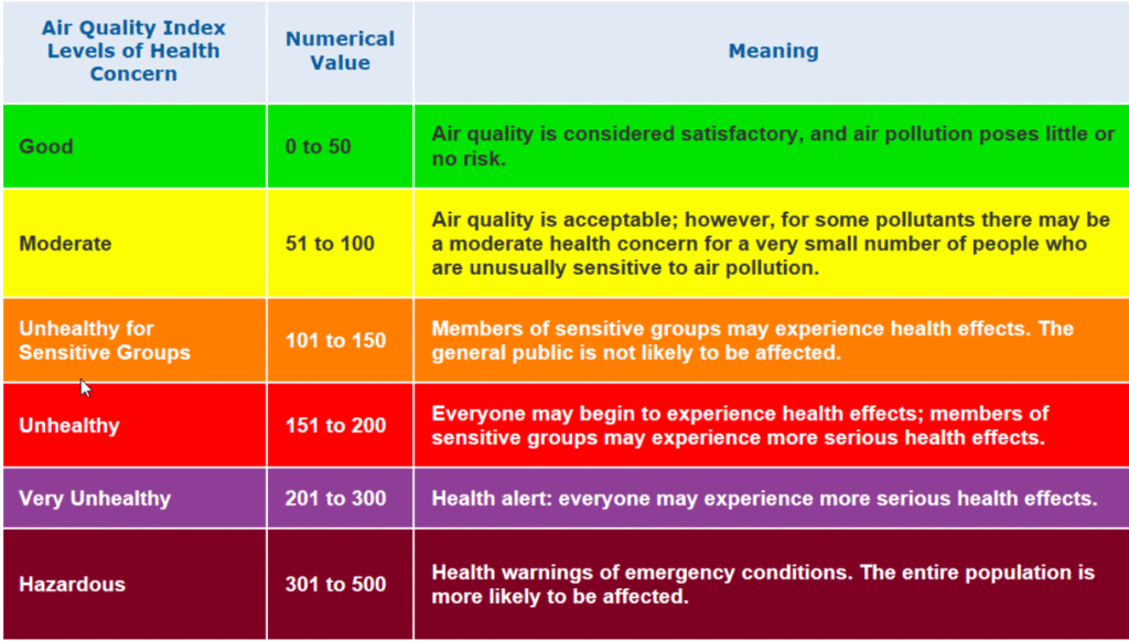
Source: Camfil
I think the Green/Yellow/Orange/Red is quite logical and follows the general concept of a stop light. But Red means Stop. Shouldn’t the alert level that means PEAK EMERGENCY – DON’T GO OUTSIDE be Red and not Maroon?
Maybe I’m too influenced by my age and experience. As a Boomer, when I think of Purple and Maroon, I think of Prince and flower children of the ‘60’s. That does not inspire the same level of concern as this air quality index color seems to provide.
Consider the colors of the rainbow. Red is the peak and purple is the lowest end of the spectrum. How did purple and maroon become the peak levels of air quality concern?
In communications, we need to align visual signals with desired meaning!

"Better Branding Through Science"